
Blog
What is Data Visualization?
An organization would need to keep track of a lot of data to keep their business running successfully. Data visualization allows combining and representing a range of data on a single dashboard using pictures, graphs, charts, maps, etc…This not only helps break down complex information into small and easy-to-understand data but also red flags the issues to take care of the issues without further delay.
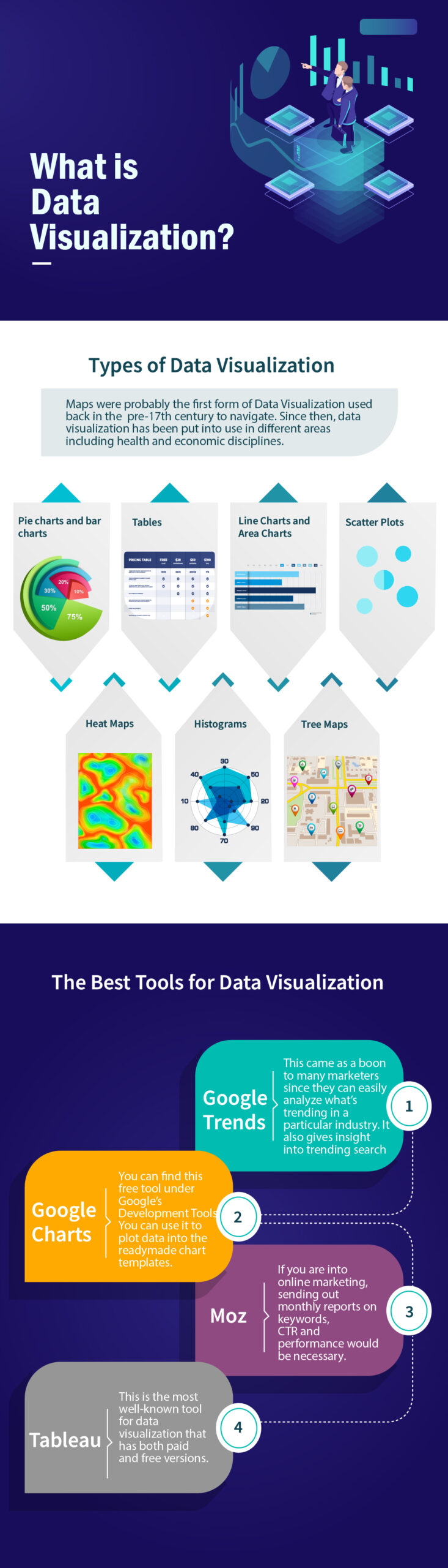
Types of Data Visualization
Maps were probably the first form of Data Visualization used back in the pre-17th century to navigate. Since then, data visualization has been put into use in different areas including health and economic disciplines. There are many types of data visualization; we have put together the 7 most commonly used data visualization types;
- Pie charts and bar charts – These graphs enable the comparison of data in a much easier way. They allow the use of contrasting colors to indicate information; this makes data easy to view and interpret.
- Tables – The use of rows and columns have always been the most preferred method to display data. Tables allow you to display a lot of data in the most organized manner.
- Line Charts and Area Charts – When you want to compare values over a period of time, then line charts and area charts can be used. Line graphs help demonstrate changes in a value by connecting data points with lines. Whereas, area charts stack data one over the other and differentiate the values using color fills.
- Scatter Plots – These graphs are mostly used to analyze the correlation between variables. The data is captured in the form of dots where 2 values intersect.
- Heat Maps – It is used best when we need to record behavioral data based on location. Data is differentiated using colors.
- Histograms – They are similar to bar charts and are best used to record data for a specific frequency or range. Bar charts can be recorded vertically as well as horizontally, but Histograms can only be demonstrated horizontally.
- Tree Maps – If you want to record value for a range of different metrics that fall below the same category, then a tree map (also known as a tree chart) can be used. Hierarchical data is represented within nested rectangular structures.
The Best Tools for Data Visualization
Every business needs to create eye-catching data visuals to get information across teams faster and in an easy manner. Several tools can combine and represent data in the form of charts, graphs, or animation. Here’s the list of most commonly used data visualization tools.
1. Google Trends
This came as a boon to many marketers since they can easily analyze what’s trending in a particular industry. It also gives insight into trending search terms for a specific business
2. Google Charts
You can find this free tool under Google’s Development Tools. You can use it to plot data into the readymade chart templates.
3. Moz
If you are into online marketing, sending out monthly reports on keywords, CTR and performance would be necessary. Moz offers the most customizable reporting dashboard wherein you can display a lot of information in the most user-friendly and hassle-free manner.
4. Tableau
This is the most well-known tool for data visualization that has both paid and free versions. It allows you to create and store data in the form of a 3D gallery.
Whether you prefer using Google Charts to organize simple information or Tableau to create an interactive infographic, make your reporting and storytelling efforts worthwhile.
Call Hubra Digital to understand our data reporting capabilities!

A website audit is the last thing on the minds of Read more

GBP is a step toward achieving local search succes Read more